Sports Direct
Problem solving, Customer Pain Points and Responsive Design


The Client
Sports Direct is an online marketplace and the UK's largest sports retailer, operating over 400 stores in the UK alone. The brand is known for "Your one stop sport shop".

The Problem
Sports Direct was reported from the current Which? Survey, “to be one of the worse online retailers”. E-commerce over time has seen online shopping increase, due to changes in shopping behaviours habits. Customers prefer instant and online accessibility of purchasing and viewing products. Some of the biggest changes in e-commerce over the last decade include: The rise of online marketplaces; The shift from desktops to mobile; The tremendous growth of digital marketing and advertising; and the future of e-commerce involving Augmented Reality and Virtual Reality.
A lot has changed this year, with the COVID-19 pandemic which has forced retail shops to close in-store and focus their services purely online due to lockdown rules and restrictions. This culture change has reinforced the necessity of a strong e-commerce platform and has made it clear which brands may be lacking in this area of the business. The homepage and sale section of Sports Direct needs optimising and the current Quick Buy feature needs improving, to make sure it is as easy as possible for customers to navigate and to quickly add multiple items to their basket.
On the Desktop platform there is too much for the customer to digest and process against strong branding colours, the navigation is unclear and poor text legibility is present. Through user research it is evident that the help button is needed on the homepage to benefit customers throughout the online journey. The current route to market strategy on attracting more customers to sign up needs to be enhanced. If items are on sale, customers want to purchase products quickly before they sell out, the current Quick Buy feature needs to be refined for optimal use.
On the Mobile Platform users complained of the speed of the fast-moving carousel and just like the desktop very overwhelming with options. Multiple pages did not load effectively, and various copy was cut off. This platform is not built for multiple purchases leading to customer frustration and loss in sales. The navigation and responsive design between the desktop and mobile are not streamlined which is a massive weakness of Sports Directs platform.

The Solution
With the brand name “Sports Direct”, the word “direct” implies fast and straight to the point e.g., no complications, which needs to be reflected in the brand site and to enhance the user experience. Below are the solutions to tackle the problems discovered.
-
A clear quick buy feature and journey
-
Optimal use of white space
-
Balance of informative text and strong visuals
-
Navigation and text legibility improved
-
Refer a friend page created with an incentive
-
Responsive interface on both platforms

The Result
The result is a seamless customer experience on both platforms mobile and desktop and the design implemented will improve the company’s current conversion and retention rates. The main objective was to refine the quick buy feature which has been accomplished which will help the business to increase sales and have less enquiries. The referral scheme has been improved with an incentive to get more loyal customers and to attract future customers. The right balance between helping Sports Direct increase brand awareness and sales has been achieved as well as ensuring the customers’ needs and satisfaction is meet.
Design Thinking Process
Empathise, Define, Ideate, Design/Prototype, Test

Research
Business Research: Desktop and mobile platforms, Competitor Analysis, Pain Points
User Research: Customer Pain Points, Red Route Analysis, Personas, User Interviews.


Ideate
Mind Mapping and Crazy 8's.


Design
Wireframes, UX Laws, UI Fundamentals, WCAG and Accessibility Design, A/B Testing.


Deliver
Homepage
Brands original homepage (left)
Revised Desktop Homepage (middle)
Revised responsive Mobile Homepage (right)
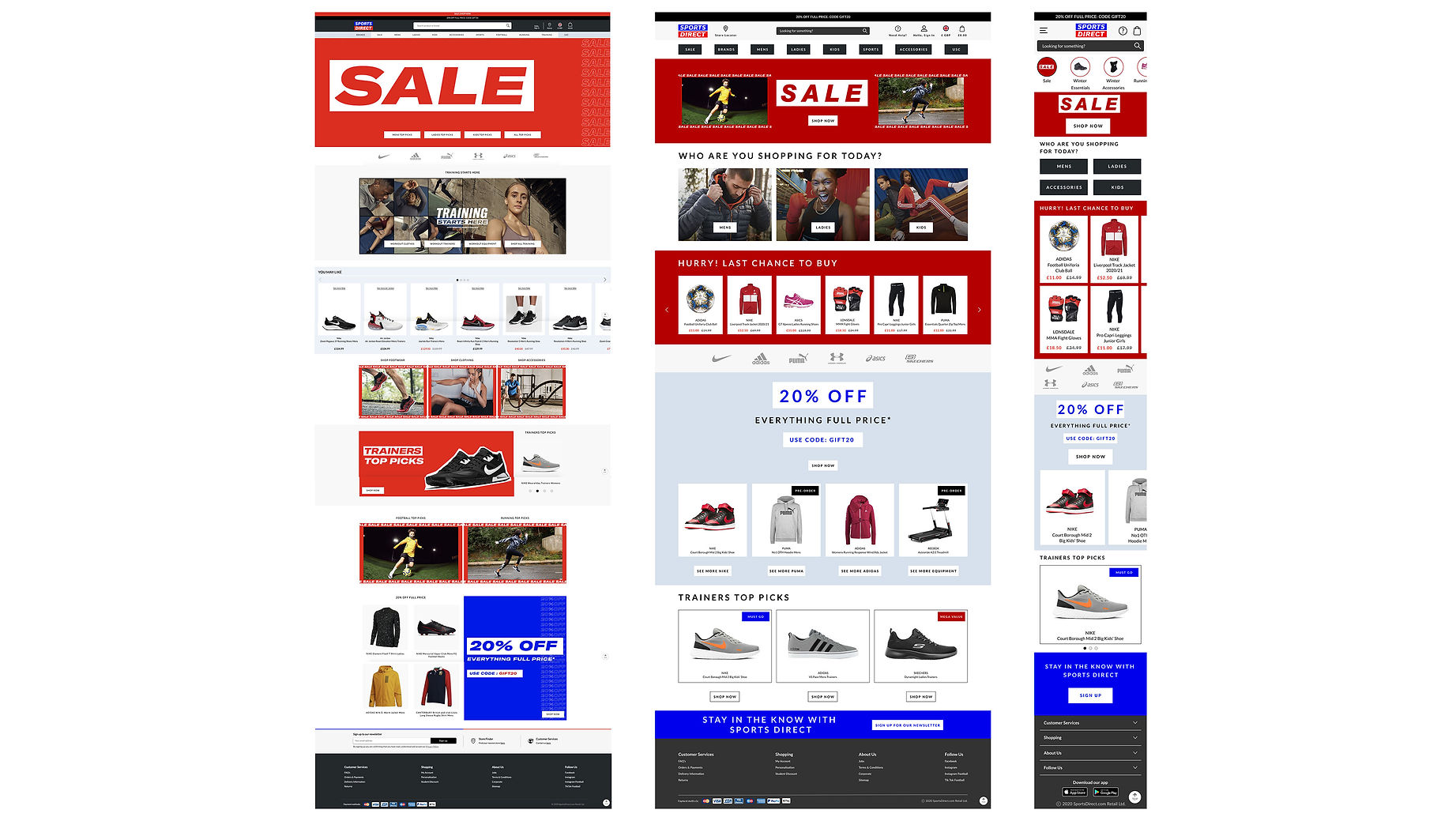

Design to match the smallest iPhone SE dimensions to the current iPhone 12 Pro dimensions.


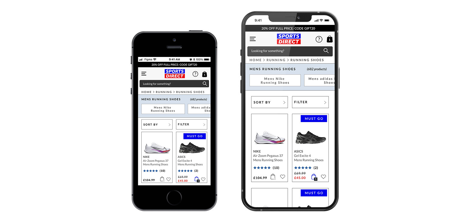
Quick Buy Feature
Desktop platform

Design to match the smallest iPhone SE dimensions to the current iPhone 12 Pro dimensions.

Refer a friend
Desktop and mobile platform
